
Mobile Navigation Design Fundamentals
There are many different ways to structure navigation when building a mobile app. Each structure has its advantages and disadvantages. Usually, the content of the app itself will dictate the type of navigation. But how do we know which one to use? Luckily for us, there are thousands of apps already built that use various techniques.Let take a look at some examples and discus both their advantages and disadvantages.
Bottom Bar
This type of navigation structure keeps a fixed set of buttons on the bottom of the screen. It is probably one of the most popular types of navigation. From many of Apple’s native apps to Facebook, thousands of apps use bottom navigation. Its easy to see why its the go to choice for so many apps:
- The navigation is always viewable, no matter what page you are on. The user always knows where to head when they need to go somewhere else.
- Always within reach. Anchored buttons on the bottom of the screen are within the tappable area, and easy to reach when using your thumb.
- Because of its popularity, its the most recognizable by users. You don’t have to teach them any new navigation styles, they’ll know exactly what to do.
- Its the simplest to implement. Developers can set up this type of navigation in no time.
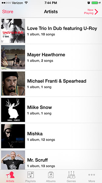
There are some details to remember about this navigation style. The bottom bar can typically hold 1-5 buttons. This limit has been a good thing for app designers, it forces them to be concise with their sections. This allows the user to easily find what they are looking for without having to dig through too many options. The bottom navigation bar needs to have easily identifiable icons. A user must be able to quickly identify what they are clicking on. Adding text labels below the icons will clear up any confusion, but bonus points to you if you can make it work with only icons. The navigation will usually end up looking a little cleaner without them.
As with anything, there are ways to break the rules. Yelp for example, turns their middle button into an action menu. Once tapped, more buttons fly out, expanding the menu options to seven. I would only use this if absolutely necessary though, A user now has to tap twice just to get to where they need to go.
Hidden Menu
The hidden menu, also called the expanding menu, is typically utilized when there are more than 5 options. These menus can be scrollable and can hold any number of links. Of course, don’t go crazy, a long list will be hard to scan when a user is looking for what they want.
Another benefit is the ability to use text instead of icons. This is great for apps like rdio. It would be difficult to create icons that represent each link in the menu.
When using a hidden menu, an anchored icon is needed on all pages to access to the menu. Never move the icon to a different location on another screen, this is very disorienting and will confuse your users. This global icon is usually placed in the top left corner because most users are trained to look here for a menu. This reflects the way people in western cultures read – top down and left to right. Theoretically, it would make more sense to put the navigation and buttons on the right. Because most people are right handed, this would improve reachability. While this is correct, we must take into account a users learned habits and stick with the norm.
What icon should you use for your menu? The infamous hamburger icon is quite common. Some people have a problem with the ambiguity of the icon. However, its widespread use is training users to associate it with ‘more options’.
One thing to note about this type of navigation in back buttons can be hard to implement. If you put the menu icon in the typical top left corner, where would a back button go for multiple pages? You may be forced to keep each screen as a single page to avoid confusion. Take a look at the IFTTT example below:
Can get a little confusing right? One last thing to note is the number of taps it takes to get to a menu option. With the bottom navigation it only takes one. With a hidden menu, one tap is required to expand the menu, and another to select the menu option. We’ve just doubled the number of taps needed to get to another page.
Home Page
Many apps utilize a dynamic home page that contains links to other areas of the app. This style of navigations allows for the most customization and can be applied to many different structures. There are quite a number of variations of this, heres a couple examples:
List
When opening apps like Feedly, you are presented with a list of options. These lists can be presented using text, icons, photos, or just about anything else you can imagine. It can be scrolling, fixed, half page or full page, the option is yours. The main downside to this style – this goes for the home page style as a whole – is going back. You need to limit the number of pages a user can drill down into. One would be ideal, although two could work. Since there is no global navigation, the user is forced to hit back until returning to the home screen.
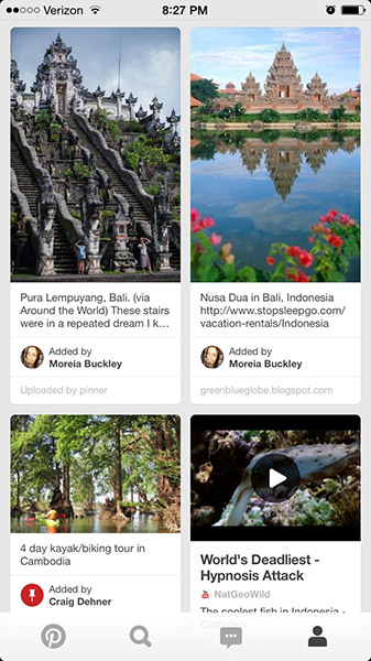
Grid
Like the list, this is pretty self explanatory. A grid is simply a layout of evenly spaced our icons or element of your choice. One tip: If you are using icons on a solid background, the grid is best as a fixed menu. If you need to scroll, style the navigation as a gridded page, or switch to the list layout. It just feels weird to scroll a list of floating icons.
Hybrids
You can have any number of variations with the home screen layout. Maybe you want a card that can slide up from the bottom of the screen and over your grid. You could also add a settings button that expands out from the side of of the screen. There are many possibilities. But as the number of possibilities go up, the ability to clutter and disorient a user does as well. Keep it as simple as you can.
What type of navigation fits best for the structure of your content? Be sure to get familiar and test them out when creating your next app. This isn’t a definitive list, so get out there and experiment!
Pingback: MOBILE WEB WEEKLY NO.86 | ENUE()