3D Touch and the Not-So-Quick Quick Actions
3D touch adds a whole new level of depth to iOS. This gesture allows for new features, one of them being Quick Actions. By pressing on an icon, the user is presented with a list of predesignated Quick Actions. Some take you to specific parts of an app, some start an action. But not all of them are actually ‘quick’.
Note: I was heavily involved in the design of iOS 9 and 3D touch. This article does not reflect any ideas or decisions during the creation of 3D touch. It is simply observations I’ve had while using this feature the past six months.
Count the Taps
Lets take a look at the various shortcuts offered by this feature. First we have our input shortcuts, these take you directly to a screen inside an app to input content or create and element. Heres Twitter’s ‘New Tweet’ action:

standard tap navigation

quick action
The previous way takes 2 taps to get to the new tweet page. Utilizing Quick Actions, it now cuts that down to… 2
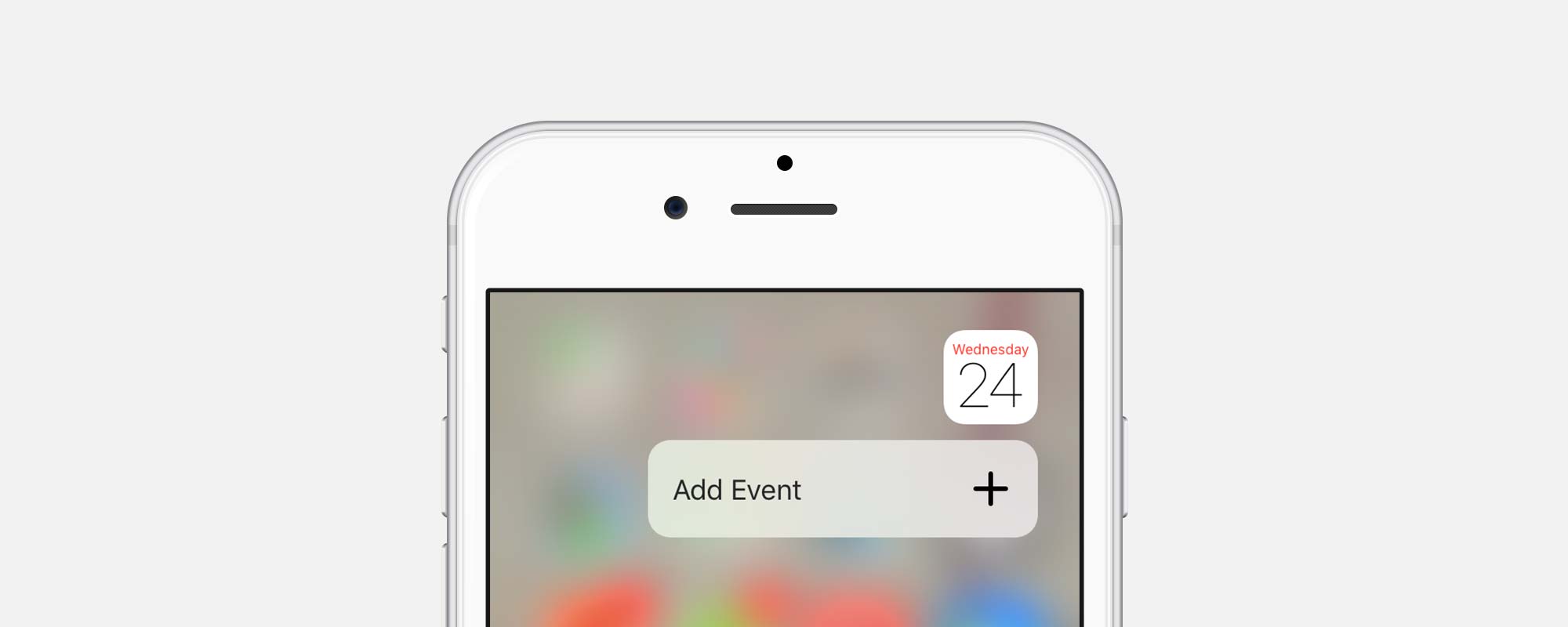
Not avery successful shortcut. Lets check out creating a new event in Calendar.

standard tap navigation

quick action
Same story. Now lets look at at a location shortcut, this button takes you to a specific page of the app:

standard tap navigation

quick action
TED, along with many others, simply move their bottom navigation to the Quick Actions. It just feels like they forced these options in to adopt Apple’s new feature. Let take a look at one last example, starting a timer:

standard tap navigation

quick action
Success! The user now avoids navigating though the app and starts a timer with one less tap.
There are only a few cases where Quick Actions are quicker than the traditional route:
- One is when the app uses a hidden menu. This requires the user to use an extra tap to expose the menu with the non-3D Touch route.
- Another is when you come back to a page deep within an app. If your last location in the Facebook app is Settings, you are required to go back to the News Feed, then the new status button.
- Last up are events like the stop watch activation. This is a deep shortcut that saves the user one tap.
However, the most of the time, these actions still require the same amount of taps as simply launching the app itself and navigating to the appropriate location.
The shortcut is no longer a shortcut, just an alternate route
Is it Actually Useful?
If we just count taps it seems like there is no harm done, just another way to get to the same place. But its not just about the math. Neutral shortcuts are killing this feature.
Why? A couple reasons.
First, users have to remember which apps have this shortcut feature available. Over half of my third party apps are currently without this feature, and 6 of Apples native apps do not have built-in shortcuts. This is not a universal action. Users are less likely to try this shortcut when it only works half the time, eventually abandoning the feature.
Second, a user has to press with force to pop up this menu. This takes more effort than a traditional tap, and requires them to alternate between gestures.
Third, Limited actions. Apps can only have 4 shortcuts, and the user has no way of knowing what they are. If they wanted something other than the four shortcuts provided by the designer, they are out of luck and have to turn back around.
The only upside I can see to this action is having a cleaner list based layout. The user doesn’t have to look around the layout of the app for the next step. A limited benefit, but still one.
Think About the Whole Story
We’ve identified that Quick Actions are only mildly successful. Location shortcuts aren’t really useful, but some input shortcuts are handy. Lets focus on this. Can this feature be modified to a fully formed feature?
In its current state, Quick Actions only take one half of the equation into account, its all about how we get IN to an app. What about leaving? Take a look at the current user flow in Twitter:

Once a user tweets, they are brought back to the Twitter home page. When I use a quick action, my goal is to send it and be done. I don’t want to hang around in the app. The logic is – If my only goal is to tweet, use the Quick Action. To browse my feed and then maybe send a tweet, open the app.
Lets solve the other half of the equation. (This thought was brought on by an article from Derek Knox. He implemented a double tap on a button to Confirm and Exit) By changing Quick Actions to a true “Quick Creation”, this will function exactly like the tweet shortcut already built into iOS:

This action displays a small popup, once the tweet has been sent, the user stays in the app. Simple and easy. The same logic will be applied to the home screen shortcuts:

With this interaction, a user selects New Tweet. A card pops up with the necessary fields. Once everything is set, selecting Post simply returns you to the home screen.
There are many benefits to this feature:
Quick. Requires 3 taps instead of 4
Lightweight. No need to launch an app for a simple task
Familiar. Events are created the same way by Siri
Practical. Similar APIs already exist for the Share menu
This feature would make Quick Actions extremely useful. Many different apps could benefit from its functionality.


Communicating Benefits
The next question is should we limit this feature to just Quick Creation? The majority of the destination shortcuts don’t have a payoff, leaving users less inclined to use this feature. We should limit this feature to either the new ‘Quick Creation” or an action that takes at least three taps (like the timer action in Clock, or creating a new tab in Safari) . By doing so we we achieve two things:
- Highlight only the shortcuts that have a large payoff
- Users aren’t left searching for a true shortcut and only getting alternate paths.
This would also prevent designers from feeling like they have to force ‘shortcuts’ into this new feature. Like the TED app, the options don’t provide anything useful to the user and water down the value of this feature.
Most apps do one thing extremely well, emphasize that.
Going Forward
Whether you are developing new features for your own app, or and entire OS, put yourself in the mind of the user. If a certain path is advertised as a “Quick Action”, treat the entire sequence as a shortcut.
This example is only examining the improvements that can be made with the Quick Actions. 3D touch as whole is an amazing technical achievement and will be an important part of future interfaces. Third parties will utilize this feature and push it in ways that iOS was not able to. I’m excited to see all the new designs
Sorry, the comment form is closed at this time.