3 Animations that Brought the Xapo App to Life
Banking apps are boring. They’re supposed to be, right? Whats exciting about checking your balance statements? Well, considering we use these apps on a daily basis, they should be much more interesting to use. Where some expect dull design, I see a whole category of apps that are begging for some beautiful motion design.
Xapo is a new breed of banking trade app – bitcoins, no fees, and an ingenious solution for using bitcoins with a real plastic card. They are bringing the digital currency into the real world. To show they meant business a beautiful mobile app was needed. After their designers laid out the visual design, I came on to bring them to life. Heres what I created and why.
Bitcoin Graph
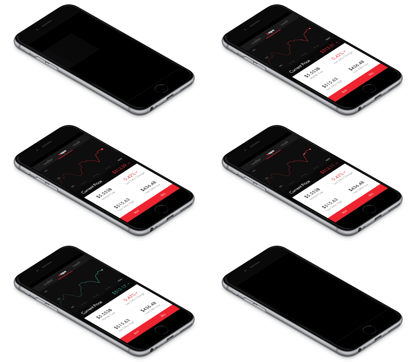
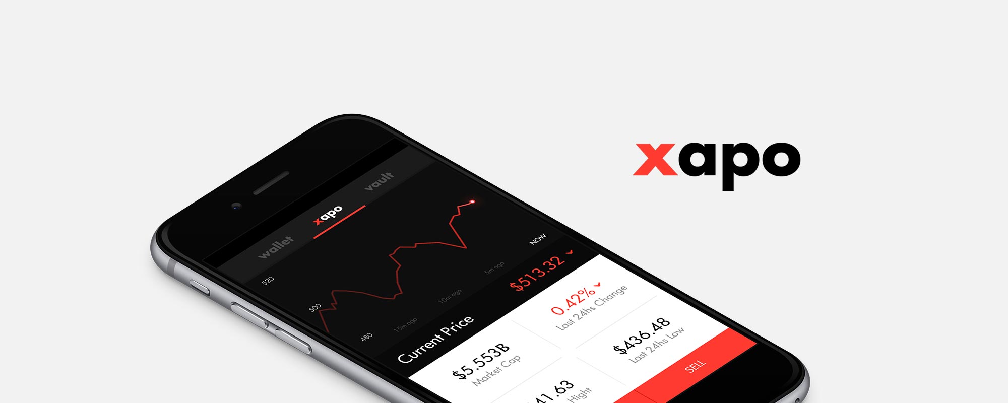
When you first launch the Xapo app, you are presented with a realtime chart of the Bitcoin price. Although we could get the new bitcoin price very quickly, we opted to update the animation every two seconds. Updating it longer than that and it seemed unresponsive. Any quicker than that and it felt too erratic. This money is essentially in a checking account directly tied to your Xapo card, we don’t want it to feel like your balance is fluctuating rapidly.

After trying various shines and glows, I ended up going with a light pulse that goes thought the last fourth or so of the chart. This mades it feel alive without being too distracting. The numbers in the price react accordingly and the arrow next to it responds when when the price is headed in a new direction. I tried a version with the arrow moving on each update, but it got too distracting. Animations should enhance the design, not be distracting.
Vault
The vault is the representation of your secure bitcoin storage. The animation for the Xapo app needs to reflect that secure feeling. But first, lets have some fun with the password input. You may have seen my previous post about login screens, this is where I first got the some of those ideas.
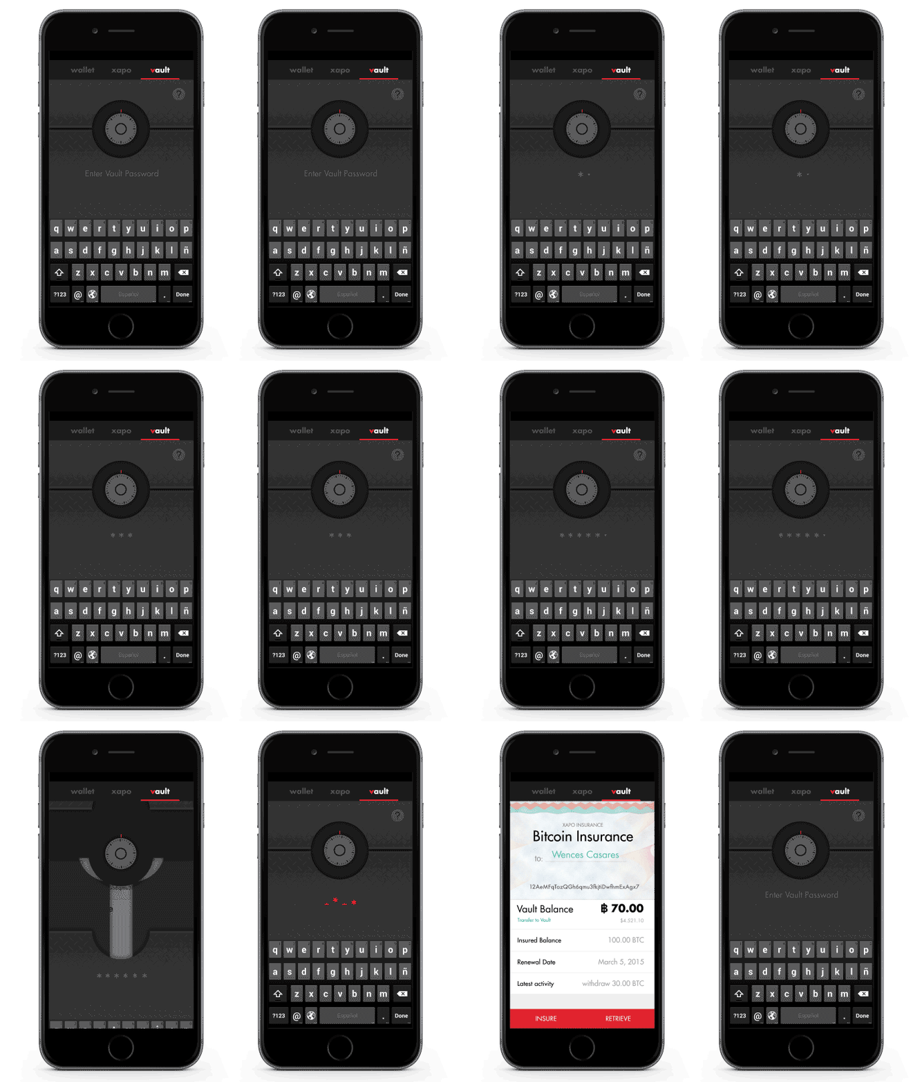
On most apps, password entry is boring, your mind usually goes blank while doing this mundane task. This is the perfect time to surprise the user with some delightful animations. First, lets turn the knob on the vault while the password is being entered. If the wrong password is entered we’ll also use the shake animation that becoming commonplace. But lets take this a step further, how about the shake detaches the asterisks? Conveniently, we have a nice line on the screen we can use as our ‘floor’ for them to fall behind and disappear. Pretty cool, add some red in there to further emphasize that something went wrong and we’re set.

Now lets open this bad boy up. When a user enters the right password, lets slide the vault doors open. In the first animations, I had two different layers that parted. Two little layers didn’t feel all that secure. So I added another, still not quite there. After adding two more horizontally sliding layers, and making all the pieces have a back and forth ‘unlocking’ animation, its looking great. Now the Xapo insurance is securely behind the vault.
Xapo Wallet
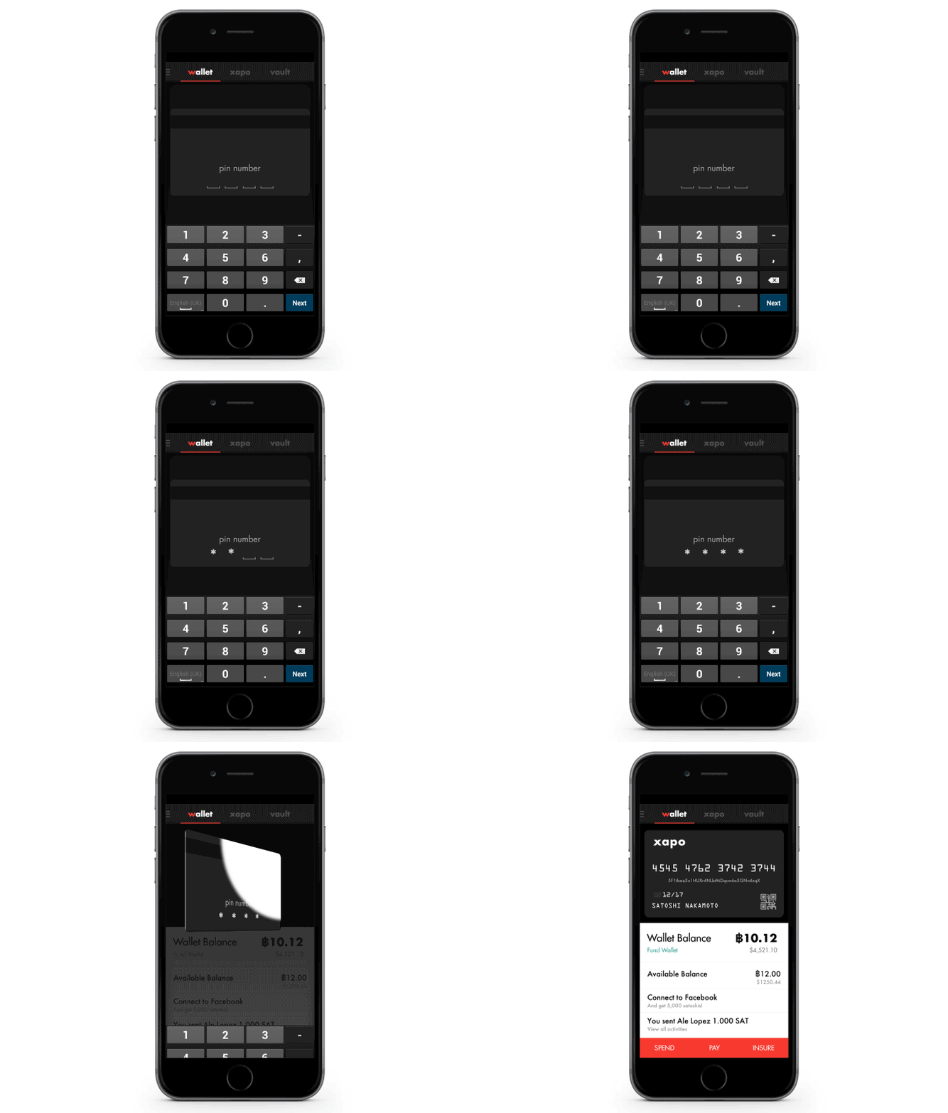
The flagship feature of Xapo is the Wallet. This is where you can access your bitcoins and tie them to your physical card. Again lets have some fun with the PIN entry and morph the blank spaces into asterisks. A subtle ‘nod’ animation reinforces that you’ve entered the right password. Once the right PIN is entered we can flip the card around and reveal all your personal data. I decided to give the card a very physical felling. A bit of skeuomorphism, gasp! Xapo’s killer feature is its connection to the physical card, I wanted to strengthen that link. This is what differentiates them from other online banks and bitcoin companies.

That wrapped up my my short collaboration on the Xapo app. By adding appropriate animations in just these three areas, we really brought some character to their mobile app. For further information, be sure to check out my recent post on enhancing login screens. You’ll find an in depth analysis and after effect tutorial for creating these effects.


Sorry, the comment form is closed at this time.