Redesigning Boxer’s Inbox
Last summer I gave myself a project, redesign the inbox flow for a iOS mail app. For a lot of theese apps, the process can be quite cumbersome. After researching and testing a number of apps, I chose to work with Boxer. The app was updated a couple weeks ago so I though it whould be a good time to show you my ideas and process for this personal project.
Boxer
My research yielded a range of mail apps. On one end was Mail Ninja, which needed a major redesign. On the other was Mailbox, which required only minor tweaks. I chose Boxer because it was in the middle – a generally well designed app with room for improvement in organization and design.
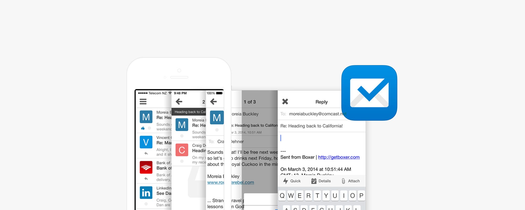
My goal for this redesign was to tightly integrate the animations and features into a streamlined user experience. In my design the common act of replying to a message is cut down from four clicks to a two step process. Tasks can now be completed much quicker, allowing the user to be more efficient. The animation of the cards is simple yet effective as a navigation tool. Other animations, like the icon transitions, are unobtrusive and not overdone simply for animations sake, but instead with the user in mind.
Current Features
Boxer allows the user to identify contacts based on icons representing their company or name.
It utilizes gestures to assist the user in organizing messages and creating actionable items.
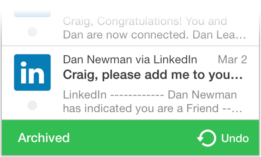
An unobtrusive message at the bottom of the screen provides confirmation of actions and gives the option to undo.
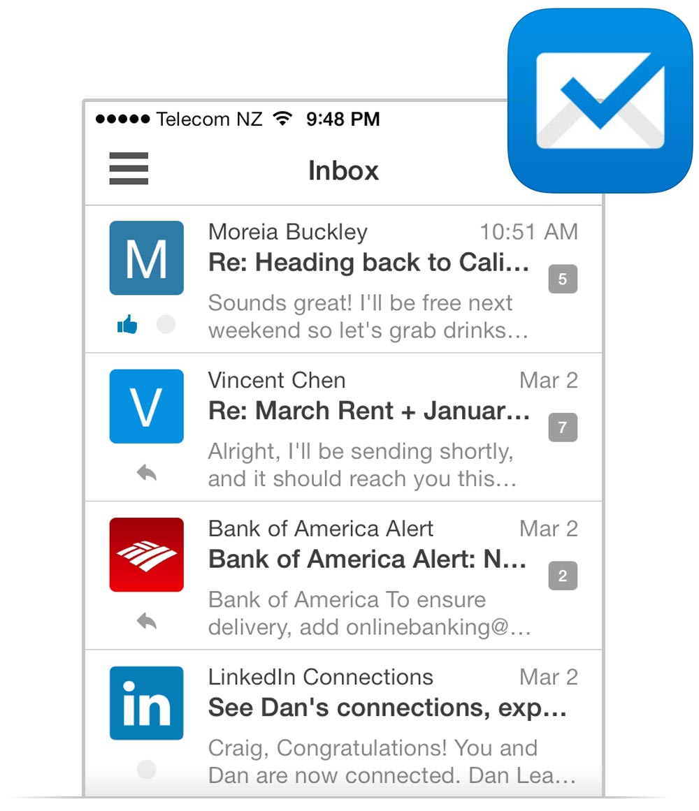
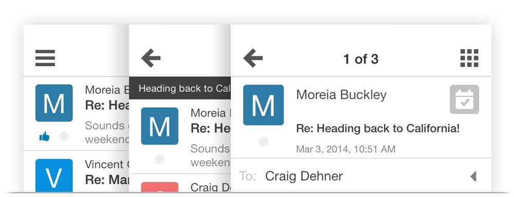
Inbox
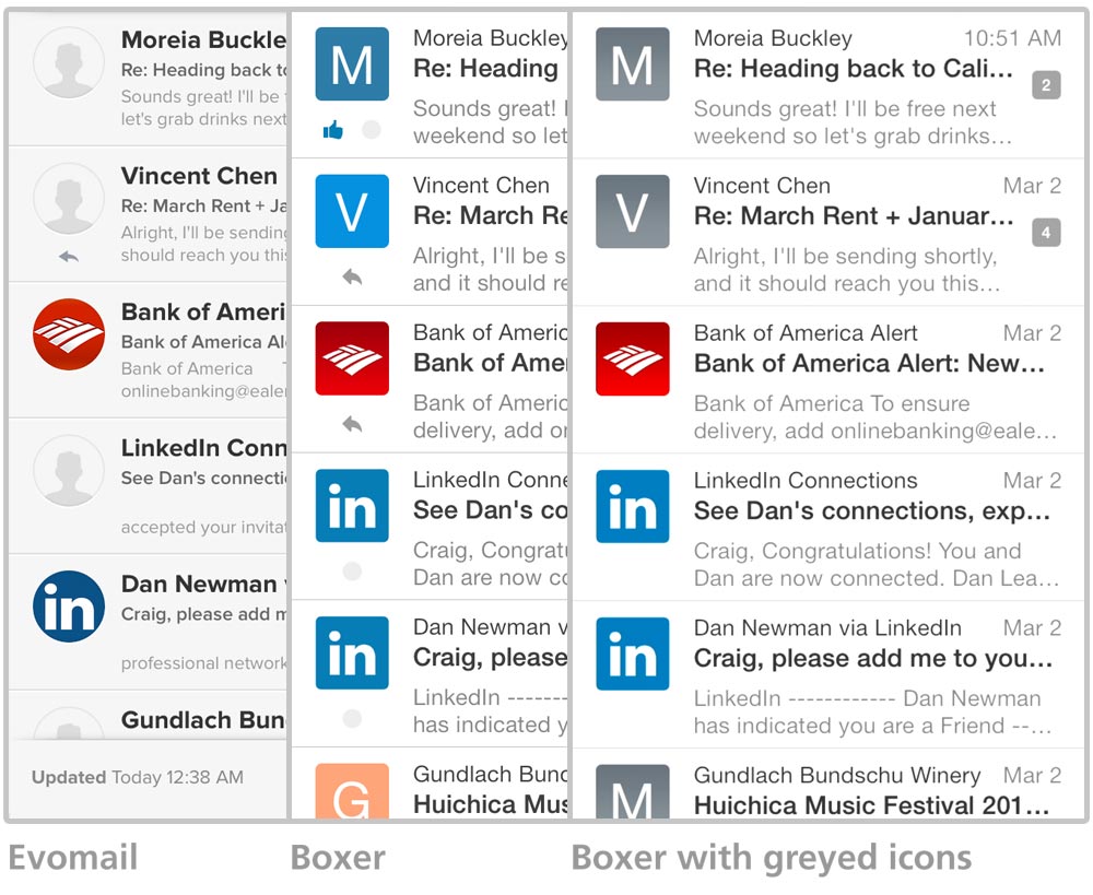
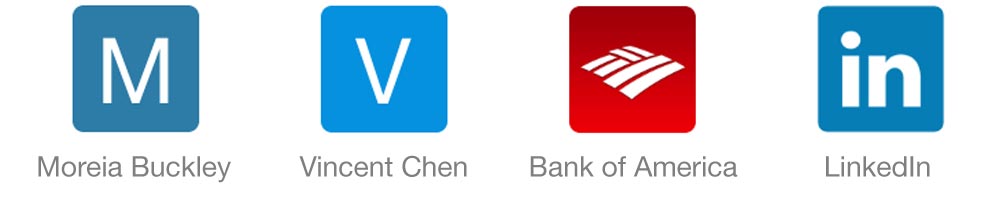
Boxer wants users to be able to quickly identify contacts by adding icons to them. Common businesses use their logo, while personal contacts are represented by their first initial paired with a random color. I believe the benefit of their intention becomes useless when saturated with too many colors. Greying the icons for personal contacts allows the user to focus on the alphabetical character, while keeping the colored logos for businesses. Using a medium grey gives all the icons a similar weight, unlike the inbox of Evomail, which unnecessarily highlights some messages.
Message View
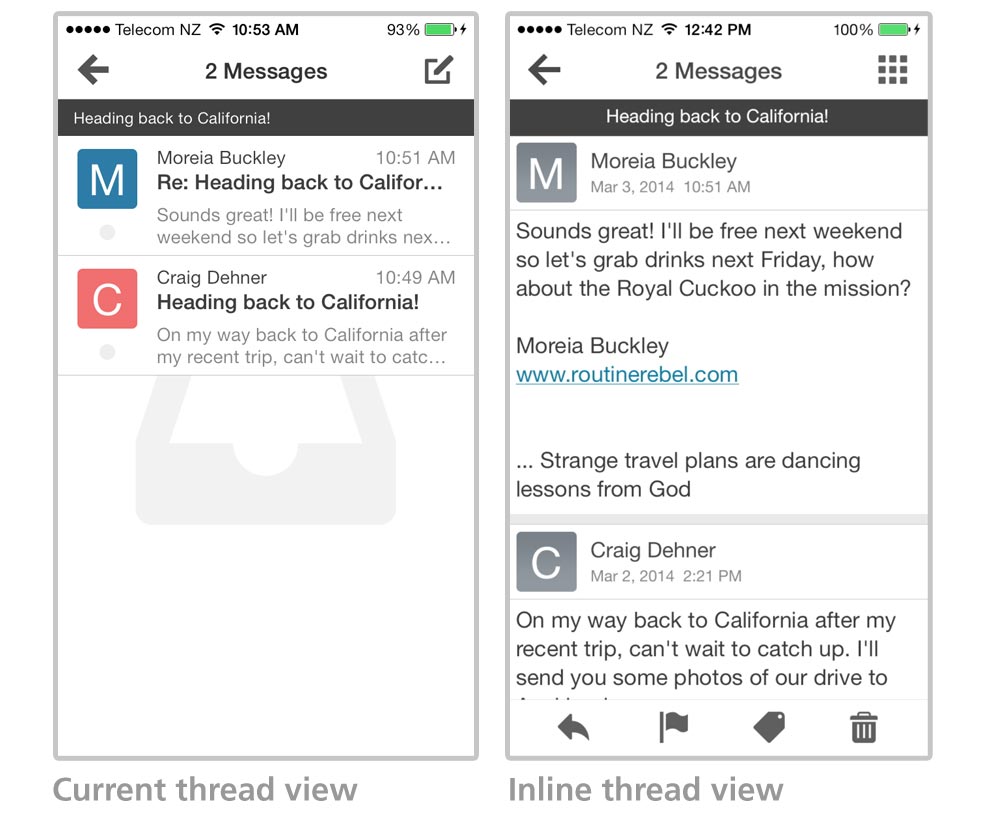
When viewing an email thread in Boxer a user must click in and out of each message to view the conversation. To streamline this common task, I’ve switched to an inline view. Boxer, unlike Evomail and Mailbox, has the right idea by using descending sorting in both the inbox and thread view. These apps, among others, use descending sorting for the inbox view, then switch to ascending for the email threads. I believe consistency and a streamlined process are important for the user experience.
Compose View
Most actions can be accessed easily with gestures, while others are unnecessarily tedious. A common task like replying to an email thread requires four taps. From the inbox the user must select email thread, individual message, reply, and then confirm the reply option.
Switching to an inline view makes this task much easier by simply sliding in a new reply sheet from the top of the screen.Moving the reply, reply all, and forward buttons to the bottom bar cuts out an extra step in the process. The remaining two slots on the navigation bar may be customized by the user.
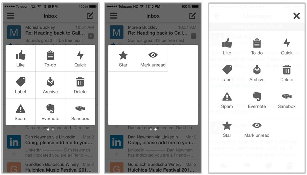
For additional action options, the user may select the action sheet. I redesigned the sheet as a full screen overlay to eliminate the second page of icons.
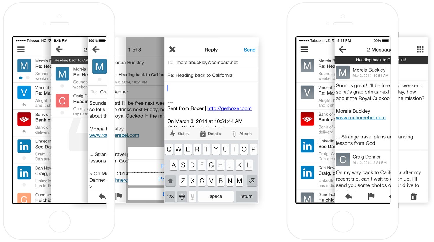
Four cards and a pop-up are required in the current app while the redesign uses only two.
Back to Inbox
After sending an email, the user must navigate back through the message and thread cards before returning to the inbox. In the new structure, the user returns directly back to the inbox, allowing them to quickly move on to the next task.
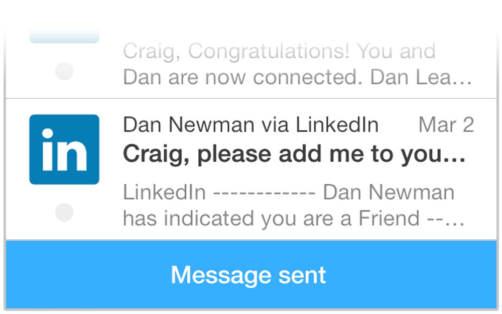
I have also added a message confirming the email was sent. Users aren’t left wondering what happened after they are returned to the inbox and keeps the status pop-ups consistent throughout the app.
Their recent redesign adopted some of these proposed features, like the inline view. Replying to a message still brings up a new card in front of the message. Boxer is really coming along, but with a couple tweaks could really stand out from the multitude of iOS mail apps.
Sorry, the comment form is closed at this time.