
Casting Characters
Look as this little guy. I bet you smiled when he fell over after his failed grand entrance. Pretty cute huh? Well, get ready because now we’re going to dissect him.

This character is simple – made up of only three parts. Alone, they don’t look like much. But once we combine them…

Well actually, they still don’t look like much. With no context, it’s a very ambiguous design. How can we communicate to others that this is a happy, yet clumsy, square jellybean?
I’m sure you guessed it – animation! How we move an object will define what it is. Animation breathes life into even the simplest objects and communicates ideas more efficiently than words or visual design.
Communicating Feedback
Now, lets give our little jellybean a voice. With no mouth this is a bit challenging. We have to rely on our understanding of human body-language and behaviors.
By simply moving the eyes on a vertical or horizontal axis, we clearly communicate “yes” or “no” … Think about that for a second, it’s amazing that humans can attach meaning to simple motion.
So, thats interesting, but what does it have to do with interface design? We can use these same movements to talk to our users. Using animation, we can turn this boring login sequence:
Into this:
The new animation communicates a couple things. A shake no or a nod yes lets them know if they entered a password correctly. We can use these animations as either support along side of text feedback, or it can completely replace text feedback, making your designs cleaner.
Another subtle, yet important part of this animation is the asterisk. Because they pop up from below the input line, and then fall back down if an incorrect password is entered. The design is communicating to the user that they are back to step one and should feel free to try again.
When a correct password is entered, the asterisks get sucked up in to the app – letting the user know they’ve been accepted.
Creation
Let’s say you’re casting an actor in a small role where he’ll be popping in to existence out of thin air. Think about who you’d like to cast … Ben Stein with his monotone persona? Oprah? Bart Simpson?
When a user creates an element in your app, its a magical action. They are a mini god and willed something into existence. Make sure to match this action with a corresponding animation, tailored to enhance the feel of app brand.
Deletion
The same applies when deleting an object. Ever seen horror movies where a person gets pulled into a dark closet by an invisible force? Same thing, but less blood.
There is nothing left for interpretation with this animation.
Branding
How you move your elements will directly influence the feel of your brand. Is it bouncy and fun? Or heavy and secure? The movement of every character in your app is a chapter in the brand story.
Minimum Viable Animation
That said, should every app look like Facebook Paper? Objects bouncing everywhere with spring recoils?
Take cues from simple character animation and bring meaning to the movement. Every animation should be intentional. Finding balance in your characters adds strength to the brand’s story and gives the user a clear understanding of their environment. Go too far and it loses its meaning, add too much and your design will get overwhelming and crowded. Remember, simplistic design does not mean it’s easy or boring.
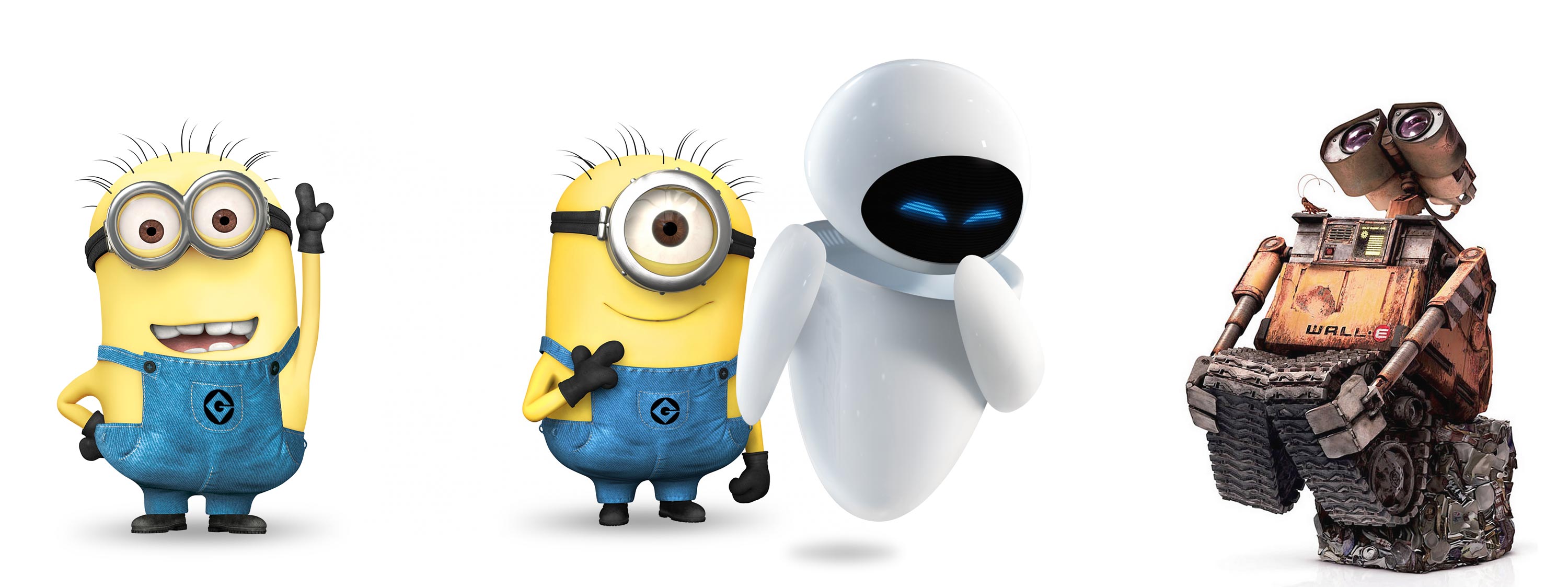
Now, homework…. go watch some cartoons and Pixar Movies! Observe some true masters at work.
Pingback: Character Animation | MultiMedia()